This visualisation effectively represents 3 of the important factors related to the data:
-Time
-Appliance
-Voltage
Things that can be drawn from the graph include the periods over 24hrs when the usage is busiest; appliances in the Living Room were all used predominantly in the evening period, and this was obvious by the chaotic web of string marked in that section of the chart.
> The visualisation is chaotic -the more results that are added, the harder it is to read.
> It does not show each individual's contribution in a way that identifies them. Eg. A light switched on at 2 separate periods would not clarify whether this was 1 individual using a lamp twice, or 2 individuals using a lamp once.
IMPROVEMENTS?
HOW CAN THIS BE DEVELOPED TO BETTER ENABLE AUDIENCE PARTICIPATION?
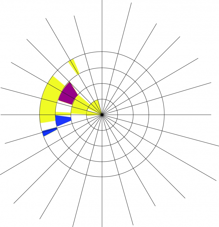
This visualisation focuses on data for 1 appliance; charged items.
Represented in the chart:
>Time (size of the segment)
>Individuals (colour)
Not represented:
>Voltage
>Other appliances
The visualisation is simple and less chaotic but difficult to interpret as there is no indication of what appliance is being focused on. Also, The more individuals adding data could cause problems as colours run out.
DATA COLLECTION and VISUAL REPRESENTATION
For the following task we recorded our usage of the electrical items within our homes, over a 24hr period. The information provided us with data that could be presented visually. The final stage of the task allowed an audience group to interpret the data from the visual representation. Essentially, the task explored the balance of communication and interpretation.
The table below, shows the data I collected over the 24hr period:
Using the data I collected, and that of the other members of my group, we identified the relevant factors that could be portrayed in the visualisation:
-Appliance
-Voltage
-Time
-Individuals (within the group)
These factors could be conveyed using the following possible indicators:
-Colour (of string)
-Length (of string)
-Density/Thickness of mark
-Spatial placement
As a group, we wanted to use as many indicators as possible so that we could communicate a rich amount of information about the data. However, the limited amount of possible indicators meant we had to choose the most important factors to convey. We chose to communicate the TIME, APPLIANCE and VOLTAGE as we felt these factors were the most important.
In this visualisation, each contributor has their own layer on the chart so that individuals can be identified and compared with others. This should mean that the chart does not get over-crowded with every extra person.
Visually, it would be effective if a large amount of people added their data to the work as the layers expand indefinitely.
However, the data may appear crowded on the first layers of the chart since the circumference of layers nearer the center is far smaller than the circumference of layers further out. In perspective, an appliance switched on for the same amount of time on both the innermost and outermost layers, may appear to be on for longer on the outer layer since marking needs to stretch a bigger distance to cover the same segment of the circumference.
To improve this visualisation further, I could either simplify the amount of information being conveyed, or introduce a 3rd dimension that extrudes from the wall. This would provide an extra indicator to communicate one of the factors. For this however, I would need more appropriate materials.
Individual
Appliance
Individuals
Individuals
Individuals
Appliances
Appliances
TIME>>
TIME
<<
In this visualisation, each line represents a different
Represented in the chart:
>Appliances (Each line/colour of string)
>Time- how long it is on for (Length of line)
Not represented:
>Voltage
>Individuals
The visualisation initially has a clean and simple aesthetic but is confusing to read as there is no logical way for measuring the. Therefore an audience would struggle to add their own readings or interpret the readings that already exist.
A very interesting visual interpretation of the data. Each appliance has its own 'chart'
Represented information:
>Appliances
>Individuals (colour)
>Time (how the appliance is on for)
(1 hr= String wrapped once around the pins)
Not represented:
>Voltage
>Time (span over 24 hrs)
As each individual adds their string it becomes very effective as you can see the build up of layers for each colour> this grows very quickly.
This visualisation is very aesthetic but difficult to interpret straight away. Each appliance has its own icon made up of a number of pins. 1 hr = 1 layer of string wrapped around the icon. This was not obvious as the number of pins used was not consistent and could not be divided into logical units of time. Eg. An Appliance switched on for 1hr15mins would be hard to plot as there is no way of showing 15 mins.
Improvements?
>Clearer intervals of time for each pin
Visual Data
INFORMATION IS BEAUTIFUL is a collection of work by David McCandless which
PACHUBE
Pachube is a data gathering website which invites users to upload their own data and connect to other data being updated by other users. The website presents information in realtime graphs to show changes .
go to research on pachube >>>
Home
Research
Project